You should spend about 20 minutes on this task.
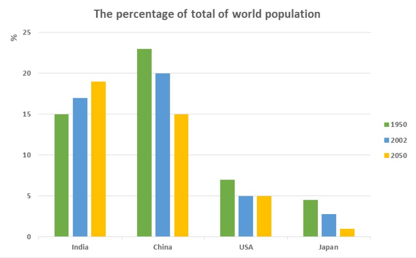
The bar chart shows the percentage of the total world population in 4 countries in 1950 and 2003, and projections for 2050.
Write at least 150 words.
Model Essay
The bar chart illustrates the proportion of global population in four nations in two years 1950 and 2002, and also predictions for 2050.
It is clear that while the percentages of population in India increases, the reverse is true for the other countries over the period shown. Additionally, China and India have highest proportions of population, whereas the figure for Japan is by far lowest during the research period.
In 1950, China was the most populous nation with the figure registering around 23%, while the Indian population accounted for 15% of world population. In contrast, about 7% of people in the world were from the USA, compared to only less than 5% from Japan. In 2002, the rate of the Indian population rose slowly, while China, the US and Japan all saw declines in their figures.
In 2050, India is predicted to have the largest population as illustrated by an increase to nearly 20%. By contrast, the proportions of population in China and Japan are projected to decrease to 15% and about 2% respectively. Meanwhile, the figure for the USA is likely to remain the same, at 5%.
(188 words)
Vocabulary
• World/ global population (n)
• the most populous nation (n)
• the rate of the Indian population
• to be projected to V