You should spend about 20 minutes on this task.
The pictures show information about average income and spending on food and clothes by an average family in a city in the UK.
Write at least 150 words.
Model Essay
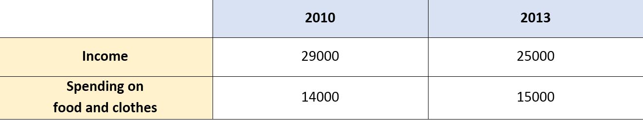
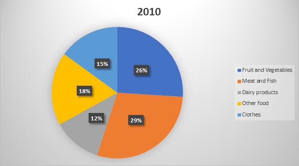
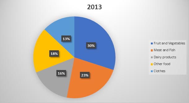
The table illustrates how much money an average family in a UK city earned and paid for food and clothes, while the pie charts represent the proportion of spending on those categories in 2010 and 2013.
It is clear that while the total income of an average British family decreased between 2010 and 2013, the amount of money spent on food and clothing increased. Additionally, British people spent much more money on food than on clothes in both years.
According to the table, in 2010, an average British family earned £29,000, while nearly half of that amount was used for food and clothes. In 2013, the average income of a family in Britain fell to about £25,000, while there was a growth of £1,000 in the expenditure for food and clothes.
Regarding the pie charts, the percentage for spending on meat and fish was highest among all categories in 2010, at 29%, but three years later experienced a drop to 23%. Similarly, a downward trend was seen in the figure for clothes, from 15% to 13% in 2013. On the other hand, people seemed to spend more money on fruit, vegetables, and dairy products as the figures went up to 30% and 16% respectively. Meanwhile, the proportion of spending on other food remained unchanged at exactly 18%.
(217 words)
Vocabulary
• Expenditure
• Experienced a drop to